I was taking a look at the
Burning Heart palette from Sugarpill Cosmetics:
And while I LOVE the idea of such bright, pigmented colors, I had to ask myself... would I really wear these colors? Do they even look good on me? I wear purple a lot, so that one isn't an issue, but red, yellow, and orange? Really?
So I decided to break out my trusty ELF 100-color palette and test them out. (Keep in mind, of course, that there's no way these ELF shadows will be as pigmented as the Sugarpill ones.) Eyeliner is Zero by Urban Decay.
So I did red:
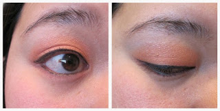
And then I did orange:
And then I did yellow:
 |
This really did look more yellow in real life.
The photo makes it look gold. |
And then I had so much fun that I kept going:
 |
| Green |
 |
| Blue |
 |
| Purple |
 |
| Pink |
 |
| Black (which I couldn't help smoking-out a little with some taupe) |
I think all the colors look cool, but obviously, I don't have an occasion to wear the brighter/more dramatic ones, especially since some of these aren't as bright or dramatic as the Sugarpill ones (compare the purple I wore versus the purple in the palette photo). But still - it's fun :) The yellow I wore is also different - a sheerer, more shimmery wash than a total opaque yellow, and in the end, I think I'd probably be more likely to wear this ELF one.
Doesn't mean that I don't still kind of want the Sugarpill ones though :) But it does make it harder to justify.